Your LinkedIn company page banner is a key visual touchpoint for your brand, giving visitors an immediate sense of who you are, what you represent, and the type of clients you work with. Getting the LinkedIn company page banner size right is essential when crafting a banner that communicates professionalism, credibility, and brand clarity before anyone even begins to scroll.
In this guide, we’ll explore what a LinkedIn banner is, why the right size matters, and how to create one that delivers real impact for your business.
Contents
- What Is a LinkedIn Banner and Why Do You Need One?
- What Makes a Good LinkedIn Company Page Banner Size and Design?
- Common Mistakes to Avoid
- Examples to Learn From
- Final Thoughts
What Is a LinkedIn Banner and Why Do You Need One?
The LinkedIn banner is the large horizontal image at the top of your profile or page, which sits behind your profile picture and creates the first visual impression of your brand. Similarly, like a websites’ hero image, it should be clean, professional, and attention-grabbing.
For B2B organisations, this prime space allows you to highlight your value proposition, showcase services, or directly connect with your ideal audience. Done well, banners enhance your brand’s appearance, build trust, and encourage visitors to explore your company further. As a result, companies that invest in a strong, on-brand banner often see higher follow rates, better engagement, and increased authority within their sector.
What Makes a Good LinkedIn Company Page Banner Size and Design?
Technical Requirements and LinkedIn Banner Size
Getting your banner dimensions right ensures it looks polished across all devices.
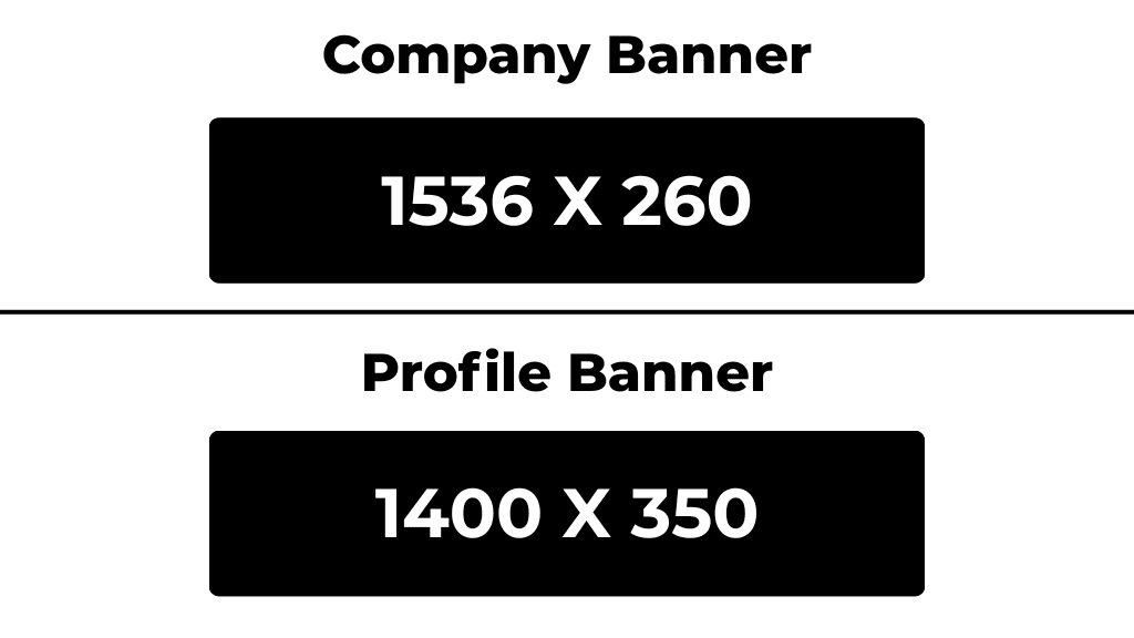
While LinkedIn’s Help Centre cites a 1.91:1 aspect ratio (for example, 1200 × 627 pixels) for posts, it’s useful to note that this mainly applies to shared images, not the LinkedIn company page banner size. For company pages, most design platforms and LinkedIn marketing experts recommend 1536 × 260 pixels, which displays cleanly on both desktop and mobile. However, personal profile banners differ slightly, with 1400 × 350 pixels performing best.
Keep your file under 3 MB in either PNG or JPEG format, and place text or logos in the central third of the image so nothing is cropped on smaller screens.
Since LinkedIn occasionally adjusts layouts and image behaviour, the best approach is to upload a test version of your banner and preview it across both desktop and mobile. Check that no important elements are obscured by your profile logo or cropped edges. Design platforms such as Snappa and Canva also provide pre-sized templates that align with current display standards and are regularly updated as LinkedIn evolves.
Using Slideshow Banners on LinkedIn Company Pages
LinkedIn now offers slideshow (carousel) banners for certain business and premium pages. What’s more, this feature allows you to upload up to five rotating images, which is perfect for highlighting multiple services, client successes, or campaigns.
Each image must follow the same dimensions and file rules. Following this, rotations of these images happen every few seconds, creating a dynamic first impression.
Slideshow banners are particularly useful for B2B brands looking to tell a story. A recommended slide layout:
- First slide: your positioning statement
- Second: core service or differentiator
- Third: client logos or testimonials
- Fourth: company culture or team
- Fifth: call-to-action or brand tagline
When used strategically, slideshow banners can turn a static header into a visual funnel, guiding visitors through your brand story in just a few seconds.
Choosing the Right Imagery for Your LinkedIn Company Page Banner
Once your dimensions are set, the next step is selecting imagery that reflects your brand and resonates with your audience. Abstract visuals suit creative or tech sectors, while professional photography often works better for corporate or manufacturing audiences.
Best practices:
- Use high-resolution, uncluttered visuals.
- Avoid generic stock photos that don’t connect with your brand. Aim for authentic imagery, like your team, workspace, or product in action.
- Match tone and colour grading to your brand palette for cohesion.
- Consider combining imagery with clean typography overlays for a polished, modern look.
With the visuals in place, it’s important to integrate your company branding thoughtfully. Your banner should complement your profile photo, not compete with it. Therefore, if your full logo already appears in your profile image, focus the banner on brand colours, messaging, or a tagline. If you do include your logo on the banner itself, keep it minimal and positioned away from the area where the profile image overlaps. Consistency is key here and using your brand’s fonts, colours, and messaging throughout the banner ensures visitors immediately associate the page with your company identity.
Common Mistakes to Avoid
Many company pages fall short because of simple, easily avoidable errors. Here are a few to watch out for:
- Low-resolution images that appear pixelated or stretched.
- Text placed too close to the edges, which can get cut off on mobile devices.
- Overloaded designs with excessive text or competing visuals.
- Irrelevant visuals, such as random cityscapes that don’t convey your brand.
- Inconsistent branding which clashes with your website or posts.
Clean, minimal designs nearly always outperform busy ones.
Examples to Learn From
Some examples of LinkedIn company banners are listed below, alongside what their core focus is:
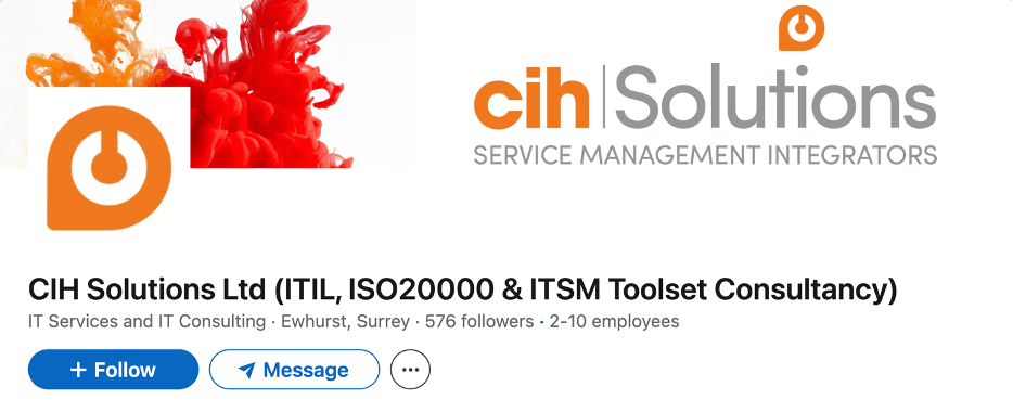
- Clarity: Communicate who you help and how, instantly.
Example: CIH Solutions uses a minimal design to clearly convey services and purpose.
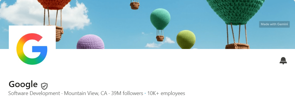
- Showcase: Show off a Tool or Product in Your Banner
Example: Google, featuring Gemini’s image creation capabilities.
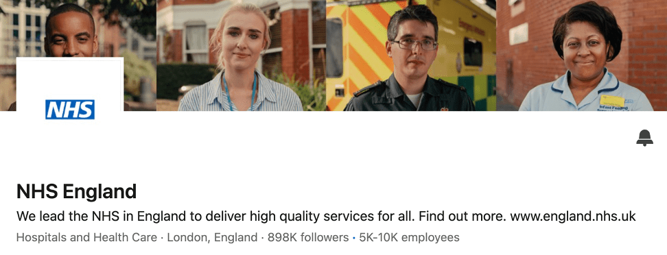
- Connection: Humanise your brand with real people or client imagery.
Example: NHS England features smiling staff images to create approachability and authenticity.
Final Thoughts
When thoughtfully designed, a banner is an opportunity to showcase your brand, attract the right audience, and set the tone for anyone visiting your page.
If you’re not sure where to start, we offer LinkedIn branding and social media support to help you get it right from the top down.
Keeping it clear, consistent, and purposeful will allow you to make a strong first impression every time.

