


If you’ve ever scrolled through LinkedIn and noticed posts you couldn’t stop swiping, chances are they were carousels. These interactive, multi-page posts let you tell stories, share insights, or showcase data in a way static posts simply can’t. Because of this, LinkedIn carousels have become an increasingly popular format for brands and professionals looking to stand out in busy feeds. They make it easier to break down complex ideas into clear, digestible slides that encourage intentional engagement rather than passive scrolling. As a result, users are more likely to spend time with the content, which can support visibility and reach.
In this guide, we’ll explore practical LinkedIn carousel examples and show you exactly how to design, post, and optimise your own for maximum engagement.
Contents
- What a LinkedIn Carousel Really Is
- Designing for LinkedIn Carousel Size
- How to Create and Post a Carousel on LinkedIn
- LinkedIn Carousel Examples for Inspiration
- Tips for Readability and Engagement
- Final Thoughts
What a LinkedIn Carousel Really Is
A LinkedIn carousel is essentially a multi-slide document uploaded as a post, where each page becomes a swipeable slide. Unlike a static image or single post, a carousel lets you present content in layers, giving readers a reason to pause and explore each slide. For example, this format works particularly well for sharing statistics, visual stories, tutorials, or case studies that benefit from explanation over several frames.
As a result, this format keeps viewers on your post for longer, which can help increase engagement and visibility within LinkedIn feeds. In addition, carousels allow brands to guide audiences through a clear narrative rather than relying on a single visual to do all the work. Therefore, for businesses looking to make a stronger impact on LinkedIn, carousel posts naturally complement broader social strategies.
Designing for LinkedIn Carousel Size
The first step to a scroll-worthy carousel is the right design. The LinkedIn carousel size matters because slides need to look clear on both desktop and mobile.
Recommended sizes:
· 1080 x 1080 pixels for square slides
· 1080 x 1350 pixels for vertical slides
Focus each slide on a single idea, use bold and readable headlines, and support text with visuals rather than clutter. Consistent branding and a clear hierarchy of text and imagery keep viewers moving through your content.
How to Create and Post a Carousel on LinkedIn
Creating a carousel begins with designing your slides in tools such as Canva, PowerPoint, or Google Slides. Once your design is complete, export the slides as a PDF, then head to LinkedIn. Next, click “Start a post” and select the document upload option. At this stage, adding a compelling title and caption encourages swiping, while tagging collaborators or featured brands can increase reach. Finally, preview your post to ensure slides are in the correct order before publishing.
LinkedIn’s official guidance confirms this is the recommended method for organic carousel posts. A well-structured carousel typically starts with a hook, such as a question, statistic, or bold visual, followed by supporting slides, and ends with a call-to-action or takeaway.
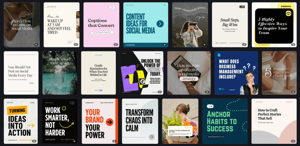
LinkedIn Carousel Post Examples for Inspiration
Carousels are versatile, and there are several ways to use them effectively. You can showcase a new product by combining visuals with concise descriptions, share industry insights using charts or infographics from reputable sources like Statista, break down a process or tutorial into clear, step-by-step slides, or highlight client success stories with images and brief text.
Each of these examples highlights the carousel’s natural strength: telling a story across multiple slides. With clear structure, strong visuals, and concise copy, carousels encourage viewers to swipe through the entire post.
- New product or features
- Industry insights
- Step by step guides
- Success story
- Event highlights or key takeaways
- Quotes or testimonials from clients
Almost any idea can be turned into an engaging carousel. If design feels like a sticking point, tools like Canva offer thousands of ready-made templates you can customise to match your brand.
Tips for Readability and Engagement
Beyond design, consider readability and engagement. Avoid small fonts and cluttered slides, and make sure each slide communicates one key idea. Consistent branding, high-contrast visuals, and a structured flow help keep viewers engaged. Incorporating a call-to-action on the final slide, such as prompting readers to explore your services, increases the likelihood of interaction.
Remember, the goal is to keep your audience moving through the carousel while providing value at each step. Engaging content combined with good design increases dwell time, which can improve visibility in LinkedIn feeds.
Final Thoughts
Creating effective LinkedIn carousels combines strategy, design, and execution. By understanding the LinkedIn carousel size, knowing how to make a carousel on LinkedIn, and learning how to post a carousel on LinkedIn, your content will stand out in feeds, tell stories, and deliver insights in an engaging way.
Ready to turn your LinkedIn content into scroll-worthy carousels? Check out our content strategy services.